Company:
e-Sherpa Group
Year:
2019
Type:
Website Redesign
My Role:
User Research
User Testing
Illustrator
Content Writer
Wireframes
…Everything!
Project Overview
My friend Paulette asked for help making her website look great. Her logo is a Sherpa, someone who can lead you to the top of the mountain. In this case, it would be the top of Google. She wanted a custom site that would separate them from their competition, and increase her visibility, so she gets more customers, more conversions, and more sales. After interviewing multiple startups and facetime testing my wireframes with entrepreneurs, I discovered users, depending on their business size and experience, will bounce if they can’t find the prices and others can’t afford monthly services.
Solution
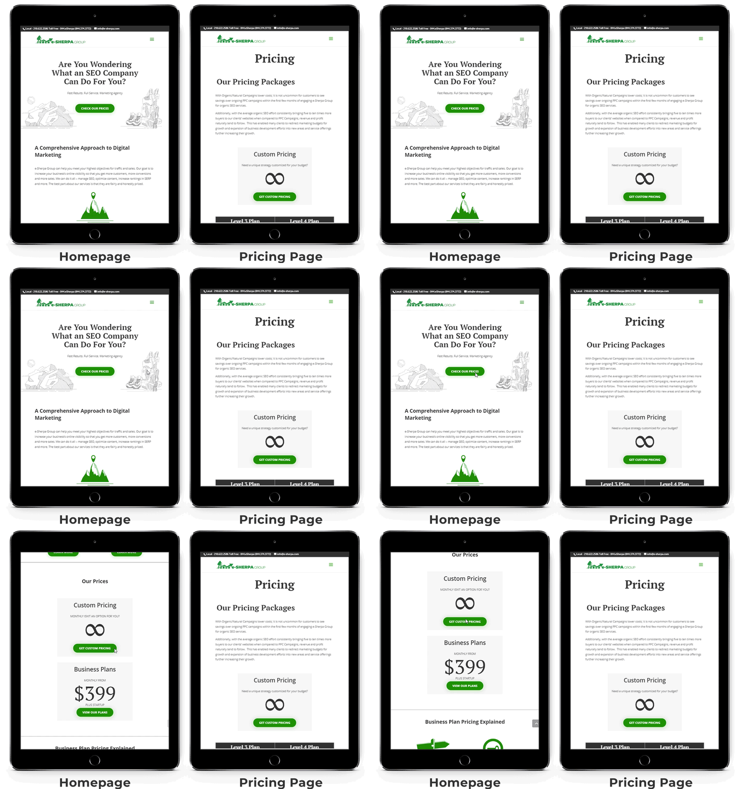
To keep startups from bouncing, I redesigned the homepage so users can discover monthly options as well as custom options for pricing. Once they have an interest in pricing, they will continue to scan the website for services. After this, they will be directed to contact my client using the contact page, completing my stakeholder's goal so she can make the sale.
To make her website unique, I illustrated each page with the sherpa + camping theme. Social Media + Swiss Army Knife, Mountain Range + SEO, Camp Site + Map Point, Night Sky + 5-Star Rating, etc… all of these elements work together to create one unique and attention-grabbing professional profile.
“I don’t want to learn SEO. I just want it done.
...Some months are lean. I can’t do monthly payments... I don’t want to test my site, I want prices!”
First Round User Test
Initial Insights:
The “Test Your Site” in the hero image of the homepage showed no value to the user’s business.
List of services in the prices page seem confusing to most users new web management. Senior startup users are more likely to read about services after checking prices.
Smaller company CEOs can't do monthly charge plans and leave the site quickly.
Larger companies understand the services and skip to the prices page to compare.
Key Takeaway:
Smaller startups can’t afford monthly fees due to lean months and needed custom options or they will bounce. To keep them invested in the site I needed to make sure they see multiple options for pricing like custom pricing and packages.
Third Round User Test Insights:
Additional Observations:
Users skip to the prices and bounce because they can’t afford monthly rates.
Users who can’t afford the prices will not bother to search for options and bounce.
To keep the users from bouncing off the pricing page, I changed the hero button into an anchor. Now it scrolls down the homepage to reveal Custom Pricing and Business Plans pricing options. Once users know the the prices are within their budget, they will explore their services.
“User reacted positively to seeing custom payment options and stayed on the website much longer.”
Key Takeaway & Solutions
Problem Statement
Entrepreneurs have limited time and money, and they need multiple options and easy to understand instructions because some months are lean, and they are searching for a partner in business to help them grow and stay within their budget.
Page Layout
WordPress using Divi Plugin
The before and after images below show how basic design hierarchy, use of illustrations, and infographics can enhance the appearance of a page and help the viewer quickly scan the page. The pages all have a similar amount of text, yet the after pages I designed with infographics and pull-quotes were read to completion more often by our users than the before pages.
Next Steps
In the next 5-6 months, I would like to check in with Paulette and see her data analytics. We should have an idea of what pages are hit the most and what pages are getting bounces and make the appropriate changes.
Kind words from the client
"Gerald was very professional and explained the entire process, from his user interviews to his illustrations, he created a fantastic custom website and couldn’t be happier with the results."
Paulette Marazzini-Pyracheta, President of e-Sherpa Group
Read Next Case Study
Learn more about me…
© 2006 - 2018
Gerald Wright, wrightux.com
All Rights Reserved, All Thoughts My Own


