Company:
BookPeople
Year:
2018
Type:
Website Redesign
My Role:
Competitor Analysis
Heuristic Evaluation
User Testing
SUS
Wireframing
Prototype
My first attempt at investigating opportunities for improving the functionality, navigation and overall structure of BookPeople’s website taught me to design for people, not myself. This case study will show you my mistakes and what I learned from them.
Overview
My assignment was to investigate redesign for improving the usability of BookPeople’s Website. I focused specifically on parents purchasing books for a four-year-old. For three weeks, I hastily evaluated their website, conducted research, synthesize the data and finalize my final design. However…
Expectations: Understand, research, sketch & design is what I expected the process I learned was to
…I was so confident in my design process; I discovered I needed to iterate the entire process to understand both the divergent goals of the parents and their kid to find a better solution. In reality, this case study is how I became a better UX Designer.
Reality: UX Design is Iterative, sometimes you have to repeat the process all over again.
Research
Competitor Analysis
I wanted to better understand this industry, so I conducted a quick competitor analysis. I focused on companies with a similar product: medium to large online stores that sold books and accessories. I highlighted a few of the apparent features the top competitors had that my client was missing in the chart below.
Heuristic Evaluation
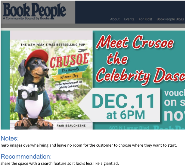
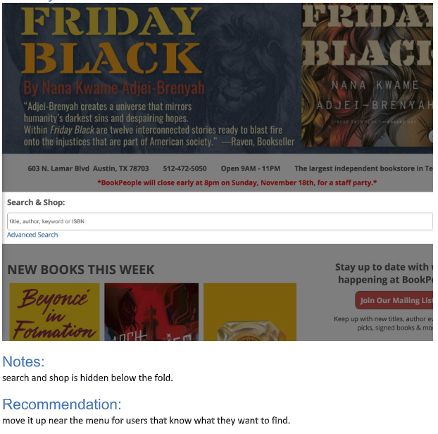
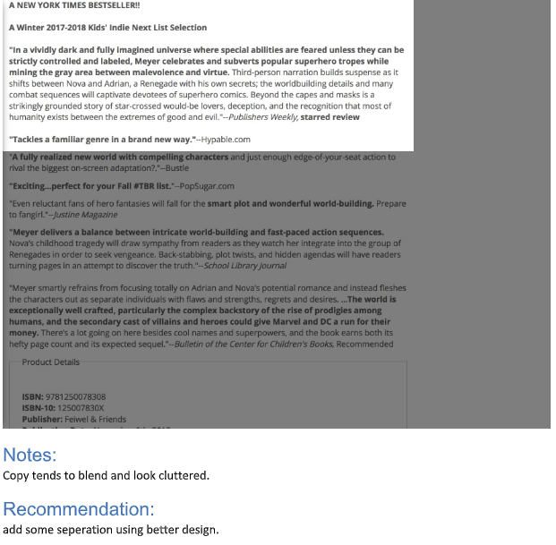
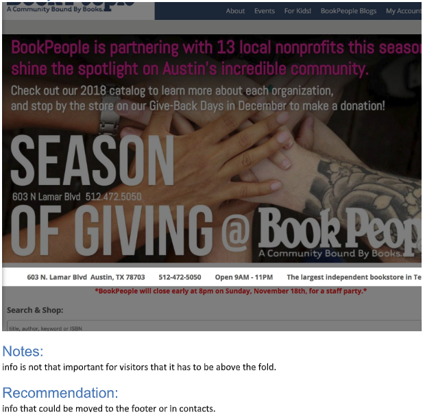
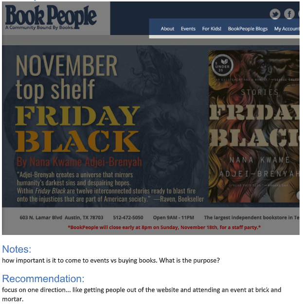
I walked through the website myself thinking how the parent might navigate with their kid — taking screenshots and notes of the many ‘obvious’ improvements I could make before my user testing. This evaluation gave me a starting point to start crafting scripts for user interviews.
User Testing
With my Heuristic notes in hand, I made a list of detailed research questions to ask my users about the website. They were very vocal about the dated design and referred to the search features common on sites like Amazon.com.
Problem Statement & Hypothesis
Based on my user tests, heuristic evaluations and competitive analysis, I determined the problem statement my redesign needed to address.
Insights:
The Advanced Search button takes you out of the purchase list making it hard to navigate.
Hero image dominates the homepage, making it difficult to see the search field or any books for sale.
The cart is hard to find on the homepage due to its position in the body, below the header.
Users are distracted by the overwhelming amount of features offered on the homepage.
Product page has no way to narrow the search without leaving the page.
Solutions:
I removed any features on the homepage not related to purchasing a book.
Any features not about purchasing a book was moved the new footer.
The search field is now above the body, easy to find in the global header.
I separated the cart, and any feature related to return members from the main menu.
Update the product page with modern navigation by adding faceted search items on the left column.
System Usability Scale
Near the end of every user test, I took a quick SUS survey. The complaints by my users mirrored the low SUS score averaging 46, well below a passing score of 68. I will use this as quantitative research as a way to judge my design in my second tests. It’s at this point that I felt comfortable moving right into prototyping.
Gray bar at the top is a passing score.
Wireframe & Validate
I decided to build a desktop wireframe instead of mobile because the majority of my users used a desktop to shop online with their four-year-olds. In the carousel below I made sure to address as many navigation pain points in my design as possible to move forward.
Field Research
With my mid-fidelity prototype in hand, I went back to my users to get some feedback. My SUS score improved from 47 to 67.5, just above the passing score of 65! This measurement provided me with a measurable improvement in usability for my case study.
This is not how this case study ends! Please continue reading…
Secondary Research
Major Secondary Insights
Thanks to my prototype, the navigation was no longer a distraction to my users. However, this time when I gave them a task they shared stories with me about their kids online. One of the kids asked what kind of phone I have (Pixel 2 XL) and immediately asked if they could play games on it. Others were shy so offered my phone to them, and their eyes lit up! Some of the parents admitted to just giving their tablet to their kid because they want some alone time. This lead to one story about them getting a bill for $700 worth of game accessories! The less my users and I focused on the navigation, the more stories I heard about their kid's adventures online.
After annotating my recordings, I realized the parent's idea of accomplishing their goal was different from their kids. For example, when a parent is shopping online, their goal is to purchase the item quickly; however when a child shops online, it’s the journey they take to acquire the thing where all the fun is. They want it to play challenging puzzles and constantly validated after every step: the more rewarding high-fives and sense of accomplishment they receive before purchase, the better.
New Insights:
When purchasing online, the parents measure of success while shopping is much different from their child!
At that age, kids need something they can touch & interact with, or they lose interest.
Kids are pretty bright and can lead to some costly mistakes involving real money.
Kids are creatures of habit and consistently ask for tablets and phones because they know they have games.
New Solutions:
Add an avatar to give kids validation when navigating the new landing page.
Add an intuitive way for parents to Lockdown the landing page when/if they step away.
Rebuild the kids landing page to be more interactive so kids will return to play games and puzzles.
It can be a collage of popular kids characters where they choose three of a kind.
It could be a sandbox where they can drag colorful type together to spell their favorite book titles.
Build a coloring book using outlined drawings of popular kids book covers for sale.
Retrospective
What I learned:
Kids are difficult to work with so try to make my writing scripts as simple as possible let the subject matter expert/parent tell you what it’s like to entertain a kid all day, every day.
The most important lessons I learned on this project is to not expect a clear outcome because that is not showing empathy to my client but catering to my own assumptions.
I’m not ready for kids of my own.
Next Steps:
If I continued the project, I would research other kid-friendly websites like Scholastic.com, Funbrain.com, Peppa Pig, Disney and Nickelodeon to draw comparisons and start sketching some new wireframes based on my new solutions listed above.
Read Next Case Study
Learn more about me…
© 2006 - 2018
Gerald Wright, wrightux.com
All Rights Reserved, All Thoughts My Own

