Company:
Wellthy Soul
Year:
2019
Type:
Website Redesign
My Role:
Heuristic Evaluation
User Testing
Rainbow Spreadsheet
Improve SEO & SMO
Wireframing
Prototyping
Project Overview
For this project, UX Designers Sarah, Garrett, and I were tasked with creating a user-friendly experience online for Wellthy Soul. Our point of contact Layne is the founder and one of nine health coaches whose programs are virtual and can be completed from anywhere with internet access.
Solution
Using research and information architecture our design team reorganized her website, resulting in a better user experience on how to purchase one or all of the programs provided.
Research
The Stakeholder Goals
During our first interview was with Layne, the founder of Wellthy Soul, she told us the content is not the issue, just how it’s organized. Her target audience is postnatal women age 35-45. Her goals are:
Sell online programs
Her clients need a better way to navigate to one or all of the programs sold online.Easily join newsletter
Sign-up for newsletter is second only to the programs.Improve SEO & SMO
Client wants to learn how to improve Search Engine Optimization and Social Media Optimization
Usability Studies
My team and I focused on user testing to observe their experience purchasing one or all of the programs on her website. We created the proto-persona named Katie to remove personal bias.
Heuristic Evaluations
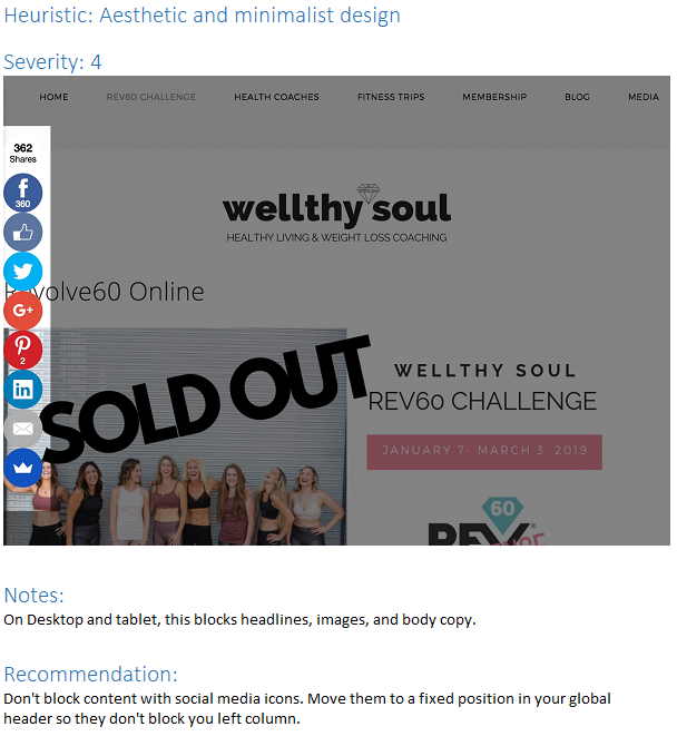
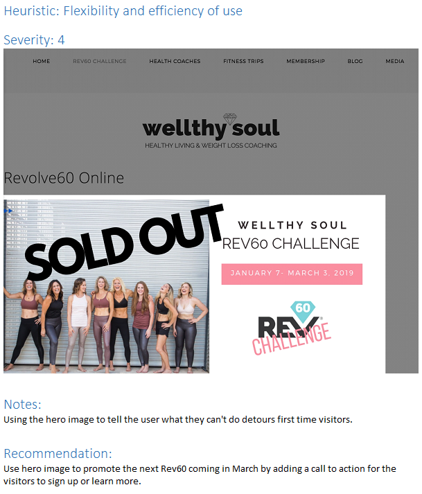
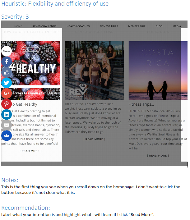
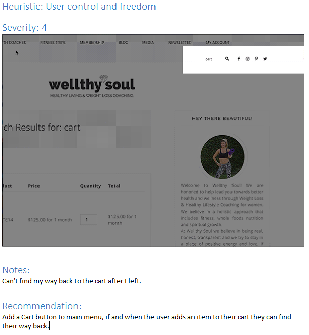
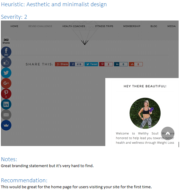
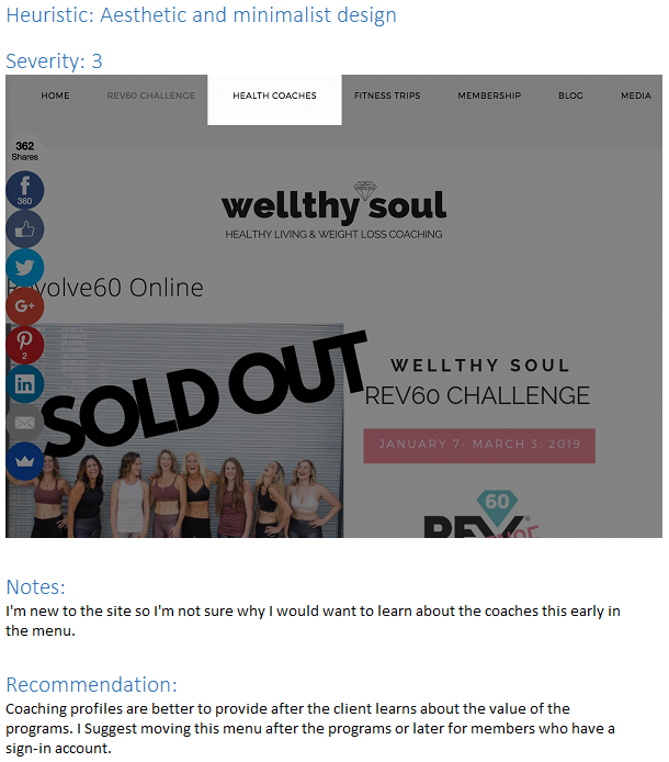
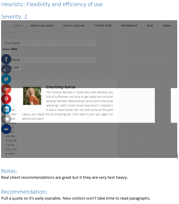
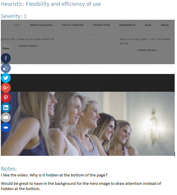
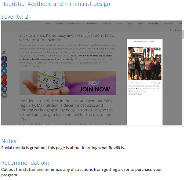
I wanted to confirm Layne’s issue with her website, so I walked through the site myself, thinking how Katie might navigate — taking screenshots and notes of the improvements I could make before my user testing. The screenshots I received gave me a starting point to start crafting tasks for my user interviews.
Rainbow Spreadsheet
As we prepared to begin our user interviews, we shared a Google Sheet with observations written in the left-hand column within our team. After we completed the walkthroughs with two female users, we colored in the row with their assigned color and shared it with our stakeholder, Layne. The visual representation of the findings this type of report provides helped her quickly understand any pain points we uncovered.
Surprisingly, none of the users were interested in the coaches.
One unique insight Layne had was that the users didn’t want to read about the instructors. According to her analytics, the coaches’ pages has the most visits on her site. We concluded that the coaches’ pages were something her clients visit after they commit to a program.
This insight justified why we would remove the coaches button from the main menu later on.
System Usability Scale
After every user test we provided a System Usability Survey to record qualitative data. The survey confirmed Layne’s reservations about her website as it averaged a score of 45.
Each column represents the score given by a user we interviewed. Anything below 68 is below average.
SEO & SMO Research
Improving Search Engine Optimization:
The health and wellness market is very competitive online, making it harder than ever to improve the ranking for our client. The good news is SEO and UX have partnered up, and with our suggestions, we may not make the first page, but we will improve its chances of getting there.
In short, what’s good for the user is good for the search engines.
SEO Strategy
Sign up for a free Google Analytics account and start tracking Direct Visits, Time On Site, Pages Per Session and Bounce Rates to see what’s working.
Remove unnecessary content and design, so each landing page has one specific goal.
Make your content easy to scan and allow visitors to focus on consuming the headline and matching the content on the landing page at a glance.
Avoid multi-level menu items. It makes it harder for your other web pages to rank in search results.
Responsive design is important. Mobile is important to new visitors, but returning visitors prefer a desktop.
S.M.A.R.T. Social Media Strategy
Without a doubt, referral traffic is the most efficient way for new users to visit. An email, blog post or a shared Facebook post gives Wellthy Soul the best bang for the buck to bring in new potential clients. To boost her strategy, I suggested Layne practice S.M.A.R.T.
Set Specific Goals: Primary goal is to increase traffic to the website. Create original content that has a clear call to action to a specific landing page in Wellthy Soul.
Measurable: Use Google Analytics ‘Social’ link to start measuring which platforms were driving that traffic so you can set goals. For example, if social traffic is at 4%, try to increase it to 5% next month by focusing on different platforms. Experiment!
Achievable: Choose a realistic goal. One Facebook/Instagram post every week...etc.
Realistic: Don’t overdo it. Quality is key for keeping users engaged when you post online.
Time Specific: Choose time frame. For example, the above could be done within the second quarter.
Do’s & Dont’s For SMO
Do post consistently
Don’t buy followers
Do follow your brand guideline when posting.
Don’t post more than two a day.
Do diversify your content per platform.
Do engage with the audience in the comments or images posted.
Do add a clear Call to Action to every post (Read More, Buy Now).
Don’t use low-resolution images.
Do use relevant #hashtags
Key Takeaway & Solutions
Problem Statement
Women with limited time and travel need a convenient way to receive health and wellness coaching because they are searching for lifestyle improvement.
Solutions:
Add the cart button to the main menu at the top for easier navigation back and forth from the cart.
Create a modern design for each landing page by removing anything not related to that page's title.
Make the four program descriptions easily scannable.
Move coaches and many other menu items out of main menu and into members section to reduce clutter.
Make sure the Blog landing pages are easily scannable with a clear call to action.
Insights:
Users like to navigate back and forth after they add something to the cart.
Users are overwhelmed by multiple menu items, photos, and large paragraphs.
Users want to find the value of a product and need validation before deciding to purchase.
What’s good for the user is good for the search engines.
Hierarchy in blogs is essential as they may be the first page a user lands on via social media.
Wireframing
User flow & Style Guide
Before I started sketching my wireframes, I needed a better idea of what pages to build. I made a simple user flow based on how a new user would land either by direct traffic or social media. I also built a style guide similar to the feminine colors Layne liked to make sure my team was consistent while building their wireframes.
Startups Use WordPress Themes
Layne preferred using WordPress and keeping cost down, so I built my mid-fidelity prototype to mimic an affordable WordPress theme I found called Hercules. It had everything Wellthy Soul needed based on our research. With my completed user flow and style guide in hand, I built a mid-fidelity prototype in Sketch of the homepage, four product pages, Shopping cart, Checkout and Account page.


The Hi-Fidelity Prototype
When we showed it to Layne, she immediately gave my mid-fidelity prototype the thumbs up. We carefully annotated our hi-fidelity prototype based our research combined meaningful content that is intuitive to Katie’s needs, and meets all of Layne’s business goals in the most efficient way.
Second Round User Testing and System Usability Score
We conducted a second round of user tests and SUS surveys to see if we were headed in the right direction. The positive feedback was unanimous by our users. Our SUS score jumped from an average of 45 up to 135. That’s a 66% improvement!
BEFORE: User testing results before our redesign.
AFTER: User testing results after our redesign.
Next Steps
If Layne decides to continue, I would suggest going back and doing some more user research based on a different user. We needed to consider what her current clients experiences are like. It could alter the current design we have now, especially in the member's page and how they return to the site to watch videos, log in and out from different devices depending on where they exercise.
Kind words from the client
"The case study this team put together for me has been a great experience for me. I am so impressed with your work, I love the colors, and every page makes perfect sense."
Layne Bruner, founder of Wellthy Soul
Read Next Case Study
Learn more about me…
© 2006 - 2018
Gerald Wright, wrightux.com
All Rights Reserved, All Thoughts My Own

